Wednesday, March 29, 2006

Looking for a Bottom in Mortgage REITs


(Drawing credit)


Mortgage REITs try to do more with less, leveraging shareholders' equity by borrowing multiples of core capital and investing all of the proceeds in mortgages, bonds and other debt secured by real estate. This leverage works wonders in years when yield curve spreads are favorable, and miserably when they are not. . . .


Among the various REIT sectors tracked by the National Association of Real Estate Investment Trusts (NAREIT), mortgage REITs were the worst performer during 2005, suffering a loss of 23%, compared to an average gain of 12% for all equity REITs (see performance statistics). So far this year, mortgage REITs continue to lag, trading flat through the end of February, versus a 9% gain for equity REITs. What's behind this underperformance of mortgage REITs and when might we expect a rebound?

Equity REITs have benefited from the lengthy bull market in real estate, and their stock prices recently have been lifted even higher by the keen interest private investment funds are showing in acquiring undervalued REIT shares and taking the publicly traded companies private (e.g., Blackstone Group buying office REIT CarrAmerica (CRE) for $5.6 billion). Mortgage REITs, on the other hand, are a different beast altogether. With their portfolios of mortgages instead of real property, mortgage REITs trade somewhat like leveraged bonds, showing more sensitivity to interest rates and the yield curve than to rents, occupancy and property operating income. Among the largest of the mortgage REITs by market capitalization are Thornburg Mortgage (TMA), New Century Financial (NEW), newly formed KKR Financial (KFN), American Home Mortgage (AHM), and Annaly Mortgage Management (NLY).

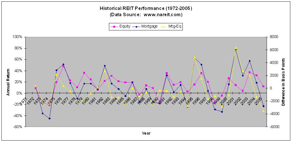
The graph to the right shows the annual performance of equity and mortgage REITs for the 34-year period from 1972 through 2005. Notice that returns of mortage REITs are considerably more cyclical than returns of equity REITs. Following four years of underperformance from 1997 to 2000, mortgage REITs showed spectacular gains for the three years from 2001 to 2003, producing returns averaging in excess of 50% per annum. Then, in 2004, mortgage REITs began to slip back into a funk, and by 2005 were lagging their equity REIT brethren by a wide margin.

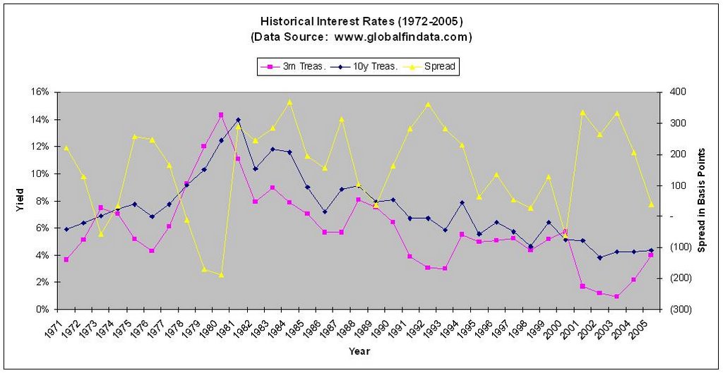
The cyclicality of mortgage REITs is due to the dependence of their underlying business on the yield curve. Managers of mortgage REITs typically leverage shareholder equity by borrowing additional funds short-term and investing into longer term debt instruments secured by real properties, similar to how banks and S&Ls run their deposit and lending businesses. Interest rate swaps and other financial derivatives may be used to manage yield curve risk, but mortgage REITs nevertheless show more sensitivity to interest rates than do equity REITs. In the graph to the right, observe how the yield spread between the 10-year Treasury bond and the 3-month T-bill shows a cyclicality analogous to what we saw above for mortgage REITs.

By examining a scatter plot of yield curve spread (10-year Treasury yield minus 3-month T-bill yield) versus the difference in performance between equity and mortgage REITS (mortgage REIT return minus equity REIT return) for the years from 1972 to 2005, we can extract the relationship between the yield curve and mortgage REIT performance. When the yield curve is steep (long-term interest rates significantly higher than short-term interest rates), mortgage REITs have historically shown higher total returns. On the other hand, when the yield curve becomes flat or inverted (long-term interest rates comparable to or lower than short-term interest rates), mortgage REITs have typically underperformed equity REITs, as has been the case for the past two years. The basic mechanism behind this cyclical overperformance-underperformance behavior is that, particularly through using leverage, mortage REITs benefit from their ability to borrow at low interest rates and invest at higher long-term rates when the yield curve is steep, but have a much harder time finding sufficient yield pick-up from credit spreads alone in a flattish yield curve environment like the one we are now in (3-month T-bill at 4.5% vs. 10-year Treasury at 4.8%).

Whether mortgage REITs will recover from their current slump anytime soon depends on what happens to interest rates. The recent peak (6.5% in May 2000) and trough (1.0% in June 2003) of the targeted fed funds rate correspond approximately to the transition points demarcating periods of underperformance (1997-2000), outperformance (2001-2003) and a reversion to underperformance (2004 to present) by mortgage REITs over the past decade. If yesterday's FOMC decision under new fed chairman, Ben Bernanke, to raise the fed funds rate to 4.75% is the last in the current series of rate hikes initiated under Greenspan, and if the yield curve begins to steepen again, we should expect to see a turnaround in mortgage REITs over the upcoming year. However, given that the FOMC indicated in their press release that "some further policy firming may be needed," it seems more likely that short-term rates will continue to rise another 25 bp or so, prolonging the flat yield curve environment and continuing to put pressure on the profit margins of mortgage REITs. However, cycles being what they are, the day will certainly come when mortgage REITs once again rise from the dead, presenting an opportunity for investors who are able to time the market correctly.

I close with a caveat based on the historical performance of mortgage and equity REITs. As NAREIT data from 1972 to 2005 indicate, equity REITs have returned 13.4% per annum, versus just 6.7% per annum for mortgage REITs over the past 34 years. The graph to the right shows how a $100 buy-and-hold position in the mortgage REIT index on December 31, 1971, would be worth about $1,000 today, while the same-size investment in the equity REIT index would have grown a whopping seven-fold more to $7,000!

Upshot: Mortgage REIT investing can be very rewarding if timed right; however, the more reliable long-term play may be to allocate a greater amount of investment capital to equity REITs and simply hang on for the ride.

Thursday, March 23, 2006

From Nano Cap to Mega Cap: Does Size Matter?


Nano cap, David, faces off with mega cap, Goliath.
(Photo credit)


You’ve heard of large, mid and small cap stocks, and probably also micro caps. But what about their gargantuan brethren, the mega caps, and at the other end of the size spectrum, the minuscule nano caps. According to Investopedia, the market cap ranges for publicly listed companies are: mega cap (above $200 billion market capitalization), large cap ($10 billion to $200 billion), mid cap ($2 billion to $10 billion), small cap ($300 million to $2 billion), micro cap ($50 million to $300 million), and nano cap (below $50 million).

Does size matter? Mega caps like Exxon and GE are stable household names closely followed by Wall Street analysts. By contrast, nano caps typically trade very thinly, rarely make the news, and are avoided by most investors. To get a sense for how market capitalization matters, we can use a stock screener to compare the different size categories. For the approximately 5000 listed companies that come up in the Yahoo Finance stock screener, the data indicate that some 97% of mega and large caps are profitable, versus just 64% of the micro caps and an even lesser 44% of the nano caps. This direct relationship between size and profitabilty is as expected, since smaller caps include both younger companies that are not yet profitable and older companies with depressed stock prices from having experienced unfortunate rough patches in their growth paths.

Restricting the stock screening results to only those companies that have been profitable over the past 12 months, we can see how "typical" price ratios and profit margins relate to market cap. The graph to the right shows how P/E is steady across the market cap categories, with median P/E consistently in a fairly tight range from 19 to 22. In other words, P/E is quite independent of company size--which reinforces the tautology that “profit is profit,” whether it comes from an elephant (mega Goliath) or a flea (nano David).

By looking at net profit margin (earnings divided by sales) and return on equity (ROE, or earnings divided by book equity value), we can get a sense for how companies evolve financially as they grow. Following its early stages when struggling to reach profitability, a successful growth company transitions from nano cap to micro cap as sales grow and profit margin expands into the mid to high single digits. Concurrently, ROE improves as the company is able to put capital to use ever more efficiently. The result is progressive evolution from the nano cap stage with a 4% profit margin and 7% ROE to the large (or even mega) cap stage with a 10% profit margin and 17% ROE.

From an investment point of view, an important element here is the multiplier effect. Suppose that a successful nano cap company is able to grow sales ten-fold. By what factor will its market cap expand? Taking the market cap of the nano company to be $40 million with a P/E of 20 (i.e., earnings of $2 million) and profit margin of 4% (i.e., sales of $50 million), ten-fold sales growth brings us to $500 million in annual sales. Efficiencies of scale boost profit margin from 4% to 8%, resulting in earnings of $40 million and a market cap of $800 million (at a P/E of 20). If sales grow another ten-fold to $5 billion, further efficiencies elevate the profit margin to 10%, resulting in earnings of $500 million and a market cap of $10 billion (again, at a P/E of 20). In this example, observe that sales have increased 100-fold, while market cap has risen 250 times, i.e., two and a half times faster. Instead of growing from nano to mid cap, the company has moved into the more prominent large cap category by exploiting efficiencies of scale and improving profit margins.

So, yes, at least in market capitalism as we know it today, size does matter.

Tuesday, March 14, 2006

What If--Just What If--the Singularity Really IS Near?

Leonardo Da Vinci, Self-Portrait, c. 1515.

From his birth in 1452 in Vinci, Italy, until his death in 1519 in Cloux, France, Leonardo defined "the archetype of the Renaissance man . . . infinitely curious and infinitely inventive." Leonardo lived to be the ripe old age of 67, at a time in European history when life expectancy was a mere 31 years. During the 500 years between Leonardo's time and today, so much has changed . . . .

(Source: Wikipedia)

The Law of Accelerating Returns

Try to imagine a world where $1000 buys a computer capable of emulating the human brain, where nonbiological intelligence exceeds all human intelligence, and where people can choose to “upload” their brains instead of dying. In his book, The Singularity Is Near (New York: Viking, 2005), artificial intelligence (AI) visionary, Ray Kurzweil, boldly presents his thesis that around the year 2045, we will achieve a “singularity” point, where technology and human intelligence become one--and the universe “wakes up.”

If 2045 is too far into the future to fathom, how about a nearer-term, though equally “futuristic” prediction? With the genetics-nanotechnology-robotics (GNR) revolution in technology now underway, Mr. Kurzweil foresees a dramatic alteration of the PC experience as we currently know it: “By the end of this decade [2010], computers will disappear as distinct physical objects, with displays built in our eyeglasses and electronics woven in our clothing, providing full-immersison visual virtual reality.” And I thought that people appear a little wacky wearing cell phone headsets and seemingly carrying on conversations with themselves while walking down the street. Just imagine how peculiar we will all look typing hands-free in mid-air, while viewing computer screens in our eyeglasses and wearing body-contoured CPUs in our clothes!

Sounds pretty far-fetched, like it’s straight out of science fiction, right? Perhaps. But what if--just what if--the guy is right? Mr. Kurzweil’s thinking is based on a new paradigm, the so-called “law of accelerating returns.” The more commonly accepted view of economic and technological progress is a linear one, built on the belief that the pace of change will continue at its current rate. However, as the increasingly rapid pace of technological evolution evidences (consider the sequentially shorter product cycles in going from radio to TV to computer to cell phone), the actual rate of progress is not linear; instead, history shows that progress accelerates over time.

Accelerating Life Expectancy

In his book Mr. Kurzweil provides an abundance of data on computer chip density, processor speed, information-technology spending as a percentage of GDP, and other indicators of the exponential rate of progress. One area that I find particularly fascinating is human life expectancy over the millennia. How should we understand the rate of change in the following sequence of life expectancy data (from p. 324)?:

Cro-Magnon era (c. 20,000 B.C.): 18 years
Ancient Egypt (c. 1800 B.C.): 25 years
Medieval Europe (c. 1400): 30 years
Industrial Revolution in Europe and U.S. (c. 1800): 37 years
Second Industrial Revolution (c. 1900): 48 years
Internet Age (2002): 78 years

Clearly, human life expectancy is increasing; but at what pace? The three graphs below display these same data points on three different scales--linear, logarithmic and log-log:


The sudden upward rise of the curve in the linear plot (left diagram) shows that during the past century, life expectancy has risen sharply compared to the slower historical trend. The logarithmic plot (center) reveals how the pace of increasing longevity is faster than exponential (since exponential growth would appear as a straight line on a logarithmic plot). Only the log-log plot (right) is capable of capturing the essence of the accelerating rate of change, with the straightness of the plotted line revealing how the exponent of exponential function itself is growing exponentially! In other words, life expectancy may be represented by a growth function of the form exp(x), where x itself is proportional to exp(t), i.e., life expectancy scales as exp(exp(t)).

The apparent exponential growth of the growth rate in the exponent of the life expectancy growth function (now that's almost a tongue twister!) seems to point to a singularity in the making. Sometime over the next 50 years or so, could it be that we reach a point where human life expectancy really does become effectively infinite? With the ongoing technological advances in the GNR revolution, perhaps the day when no one needs to die anymore will be sooner than we think.

Would Anyone Like Eighty Trillion Dollars?

Interesting stuff, all right, but what’s the connection to investing? One section (pp. 96-108) of Mr. Kurzweil’s book bears the enticing heading, “Get Eighty Trillion Dollars—Limited Time Only,” with the claim that “You will get eighty trillion dollars just by reading this section and understanding what it says.” Mr. Kurzweil explains how the law of accelerating returns is fundamentally an economic theory, and how the world’s economy is continuing to accelerate, with productivity (economic output per worker) growing exponentially. Specifically, with regard to stock prices:

“. . . [P]resent stock prices are based on future expectations. Given that the (literally) short-sighted linear intuitive view represents the ubiquitous outlook, the common wisdom in economic expectations is dramatically understated. Since stock prices reflect the consensus of a buyer-seller market, the prices reflect the underlying linear assumption that most people share regarding future economic growth. But the law of accelerating returns clearly implies that the growth rate will continue to grow exponentially, because the rate of progress will continue to accelerate.”

However, no sooner than Mr. Kurzweil presents the basis for an incremental tripling of the current $40 trillion value of the global equity markets (2% additional growth for 20 years with a 6% discount rate enhances returns by 200%, or $80 trillion), he backpedals and all but retracts his grand financial prediction with the verbiage:

“Although people realize that stock prices [will] increase rapidly, the same realization also increase[s] the discount rate. . . . Think about it. If we know that stocks are going to increase significantly in a future period, then we’d like to have the stocks now so that we can realize those future gains. So the perception of increased future equity values also increases the discount rate. And that cancels out the expectation of higher future values.”

This last paragraph is where Mr. Kurzweil’s logic eludes me. When I “think about it,” I reach a different conclusion: Assuming that economic growth really is on the verge of accelerating, any investor with the foresight to buy equities today should benefit from the inevitable run-up in prices when everyone else and his brother catch on to the new paradigm and join the expanding wave of buying, thereby lifting the market to its fair value consistent with the law of accelerating returns. I fail to see why the discount rate that investors use to calculate the present value of future profits would increase, since investors demand higher returns (i.e., use a higher discount rate) when future profits become less certain, not when profits become increasingly predictable as they would in the scenario of increasingly apparent accelerating growth of the world’s economy.

If anyone reading this understands why the discount rate would increase as Mr. Kurzweil indicates, would you please take a few minutes to post an enlightening explanation? I look forward to your commentary . . . as much as I do to trading in my laptop PC for an affordable pair of virtual-reality eyeglasses and matching electronic-weave clothing in 2010 (although I remain in the dark on the implications of infinite longevity come 2045). Thanks for your help.

Wednesday, March 01, 2006

Taming Fat Tails for Fatter Profits

“[The] Fat-tailed gecko . . . is adapted to a far different life-style. . . . It is a relatively docile animal, more shy and with different behavior patterns toward humans. . . . A new owner may cause the animal some distress, but upon becoming used to its owner, the Fat-tailed gecko is usually content to rest on a hand or arm.” (Source: www.familyzoo.us)


As in the picture of the fat-tailed gecko above, “fat tails” in finance tend to occur in pairs. In its most popular rendition, distributions of stock returns, the upper tail represents the persistence of abnormally high profits, occurring with a frequency significantly higher than can be attributed to random chance alone. At the other end of the distribution, the lower tail embodies what we all wish to avoid, persistently below-market returns.

Fat-Tailed Stock Returns

Taking the ShareBuilder Top Stocks cited in my prior post as an example, I plot the return distribution (price data from Yahoo Finance) of the 50 stocks on the list over the 16-year period from 1989 to 2005. Observe how the actual distribution is characteristically leptokurtotic (having a slender body and fat tails) compared to the random or “normal” distribution. (To facilitate comparison between fat-tailed and normal distributions, I calculate annual returns, assign percentile rankings each year across all stocks, and tally up the number of years that a particular stock exceeds that year's median annual return. I scale the number of years to the 13-year average of the 50-stock universe to bring long (e.g., Exxon with 16 years of data) and short (e.g., Yahoo with six years of data) stock price histories onto the same footing for analysis.)

The behavior behind the fat tails is the tendency for a few of the stocks in the universe to exhibit persistent price movement. For example, for the eight-year period, 1989-1997, UnitedHealth (UNH) sported 46% annualized returns, followed by almost-as-impressive 33% returns for the next eight years, 1997-2005, placing the stock solidly in the high-return tail of the distribution. On the other hand, General Motors (GM) and Verizon (VZ) have shown persistently poor returns, banishing these stocks to the low-return tail.

Even Fatter-Tailed EPS Growth

As investors, our interest in fat tails is in figuring out how to identify beforehand which stocks will occupy prominent positions on the proverbial upper fat-tail podium at the winning-stocks award ceremony a few years down the road. We all know that strong earnings drive stock prices higher, as shown in the scatter plot to the right. This is one of the few relationships in investing that has high reliability, with the correlation between EPS growth (data from Value Line) and concurrent stock returns approaching 0.8. Over the past 10 or 15 years, stocks with high EPS growth (exceeding 20% per annum), like Yahoo (YHOO), Starbucks (SBUX), UnitedHealth (UNH), Dell (DELL), Microsoft (MSFT) and Home Depot (HD), have produced high investment returns. Similarly, stocks at the low end of EPS growth (in the lower range of just 3% to 13% per annum), like Verizon (VZ), 3M (MMM), Anheuser-Busch (BUD), McDonald’s (MCD) and Procter & Gamble (PG), have generated low returns.

Knowing that EPS growth and stock returns are tightly correlated, we should take a look at the distribution of EPS growth, to see if fat tails appear here as well. Using the same methodology as for stock returns, I plot in the bar chart to the right the distribution of EPS growth for the 50 stocks on the ShareBuilder Top Stock list. The result is even more striking than for stock returns—the fat tails of the EPS growth distribution are noticeably fatter than the tails of the stock return distribution, showing that EPS growth is more persistent than stock returns. (Note: Part of the upper fat tail is comprised of stocks like eBay and Yahoo which have shorter stock trading histories, making it easier to obtain a perfect or near-perfect record of above-median performance during the full 13-year scaled term of the analysis. However, other stocks in the upper fat tail, like UnitedHealth, Home Depot and Intel, have trading histories spanning all 16 years of our analysis. I have performed the same analysis using the 30 components of the Dow Jones Industrial Average and other stock portfolios, and have found fat-tail EPS growth to persist here as well.)

As with stock returns, a quick peek behind the curtain reveals what drives the fat tails of the EPS growth distribution. Stocks with high EPS growth (like Dell (DELL), Starbucks (SBUX), Cisco (CSCO), Microsoft (MSFT), UnitedHealth (UNH) and Home Depot (HD)) in the period 1989-1997 tend to continue to exhibit high EPS growth in the next eight-year period, 1997-2005. Similarly, stocks with low EPS growth (like Verizon (VZ) and others) in the first eight years continue to show low EPS growth in the next eight years. In many ways, this persistence of EPS growth (correlation of about 0.5 between front and back eight-year periods) in corporate financial performance is as we might expect based on parallels with, for example, how students receiving high grades in school one year tend to continue to achieve high grades in subsequent years, or how athletic ability and other talents tend to persist throughout an individual’s lifetime.

Persistent EPS Growth and Stock Returns

Now, if a) strong EPS growth in one period tends to be followed by strong EPS growth in subsequent periods, and b) EPS growth drives concurrent stock returns, might we use strong EPS growth in one period to help us predict which stocks will exhibit high returns in the next period? To check on the validity of this cause-and-effect relationship, I plot EPS growth during 1989-1997 against stock returns during the next eight years, 1997-2005. Note that the correlation is about 0.2, somewhat lower than for EPS growth vs. concurrent returns (correlation 0.8) and for back-to-back EPS growth (correlation 0.5), though still notably positive.

Just how significant is this correlation of 0.2? In other words, what is the implication for investment returns? Take a look at the chart to the right. Working our way across the ShareBuilder Top Stocks portfolio ranked left to right in the chart from highest to lowest historical EPS growth for the period 1989-1997, we can calculate cumulative averages of individual stock returns for the period 1997-2005. Notice how the cumulative-average line falls from left to right, indicating how stocks with histories of higher EPS growth tend to generate higher future investment returns. For example, if at the end of 1997 we had bought the top-10 high-EPS-growth stocks from 1989-1997, we would have realized stock returns averaging 11.7% per annum, versus the lower 8.3% for the entire portfolio.

Harnessing Low PEG to Do Even Better

One pitfall of the buy-high-EPS-growth strategy is that stocks of rapidly growing companies often are very expensive, i.e., they trade at very high price-to-earnings (P/E) ratios, since everyone is trying to buy into their growth. We can improve our stock selection by taking into account both EPS growth rates and P/E through use of the ratio of P/E to EPS growth, or PEG. Then, instead of high EPS growth, we are interested in low PEG. The scatter plot to the right shows that PEG based on 1989-1997 earnings data and stock prices at the end of 1997 has a correlation of –0.25 to investment returns over the subsequent eight years, 1997-2005. Note that by taking into account the current price of the stock (the “P” in PEG), we are able to increase the magnitude (absolute value) of the correlation slightly.

Proceeding with the same analysis used in the high-EPS-growth case, we can observe that stocks with lower PEG tend to produce higher future investment returns. A purchase at the end of 1997 of the top-10 low-PEG stocks from among the same ShareBuilder Top Stocks list used above would have generated an average return of 13.2% per annum for the period 1997-2005. The additional 150 basis point per annum pick-up over the 11.7% return from the top-10 high-EPS-growth stock portfolio comes from the slightly higher correlation between PEG and subsequent returns (in absolute value terms, 0.25, versus 0.2 for EPS growth and subsequent returns).

Aiming for Fatter Returns

We are finally in a position to apply our results to enhance our chances of realizing better investment returns over the years ahead. The chart to the right shows members of the ShareBuilder Top Stocks list, classified across the two relevant parameters: EPS growth and PEG. For EPS growth, I use historical data from Value Line for the eight-year period, 1997-2005. For PEG, I use current numbers from Yahoo Finance, which are based on analyst consensus earnings estimates for the next five years and current P/E ratios.

At this time, the stocks on the list with the highest historical EPS growth and lowest PEG are: big-box home improvement retailer, Home Depot (HD); its competitor, Lowe’s (LOW); PC-maker, Dell (DELL); health care services giant, UnitedHealth (UNH); and heavyweight motorcycle-maker, Harley-Davidson (HDI). All of these stocks have historical EPS growth above 20% annually and PEG ratios near 1.0. Also of interest may be Google (GOOG) and eBay (EBAY), with triple-digit historical EPS growth rates and relatively attractive PEG ratios around 1.5, corresponding to current 23% (Google at 365 vs. high of 475 in January) and 32% (eBay at 40 vs. high of 59 in December 2004) price discounts from their all-time highs. Yahoo (YHOO), Starbucks (SBUX) and Whole Foods (WFMI) look appealing from the perspective of high EPS growth; however, their relatively high PEG ratios (all above 2.0) lead me to believe that better value resides in the other stocks cited.

To the extent that fat EPS growth tails continue to produce fatter-than-normal future stock returns, as they apparently have over the past 10 to 15 years, we can expect to realize above-average returns by buying stocks of companies with high historical EPS growth at relatively attractive, low-PEG prices.

Back to our lizard analogy . . . In the spirit of the proud owner of a once-timid, now-tamed fat-tailed gecko resting contentedly in the palm of its owner’s hand, may you too one day bask under rich, warm skies with fat-tailed profits lining your pocketbook!